Tuesday, December 27, 2011

Snap Dragon

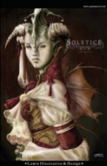
Here is an interpretation of what a tropical wild flower would look like if it were combined with a dragon.  The image is called "Snap Dragon" a line-art image taken from Leather Wings Semblance that I really enjoyed working on.  I had no idea where I was going when I started painting this illustration but I knew that if I kept pushing through I would come up with something interesting.  I hope you like it!

Lamin


Tuesday, November 15, 2011

Then and Now

Here is an image I completed for the TD Bank "Then and Now" black history month poster competition! Unfortunately I didn't win but I had a lot of fun working on this image.  The feeling I was going for was a mix of a 1930's jazz singer combined with a 70's hairstyle.
What was also great about working on this image was that it was my first time working entirely on the Cintiq 21UX that I bought a few months ago.  It took me a while to get used to but drawing on a screen rather than on paper soon became very intuitive and natural.  I'm really looking forward to producing more work using the Cintiq as an integral part of my work flow.


Sunday, November 6, 2011

The Art of Lamin Martin Solitude Video

The Art of Lamin Martin Solitude occurred on October 7th, 2011 where canvas prints from Lamin Illustration & Design were presented in a gallery style setting at the Toronto Cartoonist's Workshop in Downtown Toronto.   Thank you to everyone who made it out to the unbelievably successful show and a special thanks to the Toronto Cartoonist's Workshop for hosting the event and to Guerilla Printing for providing print promotional material of the highest quality.  For those who weren't able to make it out to the creative networking event you can enjoy video from the opening evening by following the image link below!

Thank you so much for the support!

Lamin


Thursday, October 13, 2011

Electric Playground - The Art of Lamin Martin Solitude

Electric Playground visited The Art of Lamin Martin Solitude exhibit where they were kind enough to conduct an interview discussing the images and themes showcased at the event.  Below is a clip taken from Season 21 Episode 232 of Electric Playground's "Profiles" featuring the art of Lamin Martin.


You can also catch the full episode HERE.


Sunday, October 2, 2011

Army of Me

People love steampunk for many reasons.  Two of which are, first, the costuming and detailing found in steampunk fashion is fun, beautiful and open to tons of creativity.  Second steampunk has set designs and a backstory that are absolutely fantastic.  Which is why I wanted to try my hand at a steampunk inspired illustration.  The image that I came up with is a story of a soldier who took it upon herself to take out a fleet of zeppelins, one at a time, by cutting them open and tossing in belts of grenades.  She's a specialized member of a rocketeer group who's job in the war effort is to turn the tide.

Lamin


Sunday, September 11, 2011

The Art of Lamin Martin: Solitude

On Friday October 7th,The Art of Lamin: Solitude gallery show will explore artist Lamin Martin’s fantasy concept art hosted by Toronto Cartoonist's Workshop and Guerilla Printing. The Art of Lamin: Solitude will be a creative networking experience showcasing 18 beautifully immersive two and a half foot by three and a half foot canvases, from Lamin Illustration & Design, framed and presented in a gallery setting in Toronto's trendy and cultural College and Bathurst (at Clinton) area. Books featuring collections of Lamin Martin’s extraordinary work, and prints will also be available. For more information please click the flyer below!

See you soon!


Blood and Lavender

One of the first images that I worked on when I began digital painting was Blood and Lavender. I always considered it to be one of those images that got away because it never really came out the way that I wanted it to. The lighting, the colour composition, the values never really gave the haunting sense of strange beauty that I was initially going for. Since then I've learned a few new tricks, new processes and new painting techniques that I felt I could finally apply to this illustration to do it justice. Below is the before and after!


Blood & Lavender After


Blood & Lavender Before


Blood & Lavender Line illustration

Sunday, August 14, 2011

Electric Playground Interview

Recently Electric Playground visited Czyonoft Studios, the game studio where I'm working as a concept artist,  for a preview of the work going into our upcoming game Yinasia.   We were featured in EP"s "First Look" segment and as one of the concept artists on the project I was fortunate enough to be interviewed on some of the creative process that went into the character designs.  Below is a clip taken from Season 21 Episode 184 featuring a "First Look" at Yinasia as well as a link to full episode.


Low quality clip from  Season 21 Episode 184


High quality full episode from Season 21 Episode 184

Yinasia Concept Art

While working with Czyonoft Studios as a concept artist on our upcoming title Yinasia I had the great opportunity to come up with designs for weapons, armour, creatures and the main character Leo.  Below you'll find promo material that I painted where those designs are put into action!


Wednesday, July 13, 2011

Alamptria 1 - Bloodstone Crypt

Here is another novel cover that I completed for Alamptria 1 -  Bloodstone Crypt, by Canadian fantasy writer Richard A. Valicek.

For this image Mr. Valicek was looking for a classic embrace between a vampire and a human.  In keeping with that tradition I researched tons of romance novel covers before coming up with something that is mysterious and seductive.


Enhanced by Zemanta

Wednesday, May 25, 2011

Baroque

In my journey to find new and exciting ways to conceptualize my images I took on the task of learning Maya. The reason I decided to start using Maya was for me to be able create and maneuver 3D objects through space and then arrange them into environment mock-ups that I then paint over in Photoshop, kinda' like sketching in 3D. It's a quicker and more efficient way of establishing my perspective in a 3-dimensional plane without having to plot vanishing points and draw perspective lines which can be very time consuming. The learning curve for such a powerful application such as Maya is pretty steep but if you love what you're doing you can find fulfilling enjoyment in every challenge. Below is the process!


Wednesday, May 18, 2011

Christabella

In my development and growth as a concept artist it's of course necessary to be able to render environments. To be able to come up with believable spaces for characters to exist in wasn't really a focus of mine but the more I look into the importance and necessity for it the more I love it and the more I want to work at it. What's interest about my dive into environment design is that I'm more daring in my approach to the process, meaning I'm more willing to dive into photoshop without sketching anything out first, which is what I usually don't do. Instead I fire-up Photoshop and start painting shapes allowing accidents to happen. Below is Gothic environment that I came up with that is a blend of architectural design elements. The cathedral is influenced by a mix of french and italian design, the iron grid in the foreground is a design element found in Bordeaux airport in France and the narrative is inspired by Silent Hill of a lost traveler who unfortunately stumbles into the foggy mysterious town and quickly learns that the shadows are not always as they seem and that the only light needed to cast off the darkness is found in the refuge of the church.
If you haven't come across the Silent Hill game series then do yourself a favour and check out the movie HERE or check out the games HERE.

Lamin


Sunday, May 8, 2011

Spill The Wine

The line art for "Spill The Wine", found in the pages of Apocrypha, is one of those images that's near and dear to my heart. If you're like me and you're the kind of artist who loves creating demonic characters who wear large heavy pieces of amour around the chest and shoulders, surrounded by large masses of wool with giant blood-rusted blades strapped to their arms, then you can imagine that I had a ton of fun with this image!
One of the challenges I faced in digitally painting this character was realizing that in order to create more depth in the background I had to remove the wings that I originally drew in the line art. This created some much needed negative space that I then used to display more of the demon dog. As a result of those design choices I think it makes for a much stronger piece.


Lamin


Thursday, May 5, 2011

Alamptria: Red Moon Rising novel cover

Here is a novel cover that I completed for Alamptria: Red Moon Rising, by Canadian fantasy writer Richard A. Valicek.

From the beginning the writer knew that he wanted to have one of the female main characters shown with a sexy and threatening gaze with the male character shrouded in shadowy surroundings, so most of my thumbnails were slight variations on that idea.

The challenge of this image for me was working with a large central figure whose expression tells more of the story than anything else. When working with large compositional elements like this the smallest adjustment in the expression can completely change the tone of the piece. So as you can imagine most if not all of the my sketches focused on the expression in the eyes.

The image was sketched in pencil then scanned and coloured in Photoshop.


Lamin


Sketch,


Wednesday, May 4, 2011

Transitions Mini-Golf Championship

Recently the great people at Oddly Studios and myself had the amazing opportunity to build an online mini-golf game for Transitions Lenses, the eyeglasses lens company. We were given a month to complete the work so there wasn't much room for error. Thanks to the workflow structure established by Oddly director Tim Willison, the resulting game was beautifully executed on time and it was something that everyone was proud of especially Transitions Lenses. My role in the project was to come up with concept designs for the nine mini-golf courses working with Oddly's art director Sheharzad Arshad and The Marketing Store's Neil Cabana. You can take a look at the designs below as well as what the courses looked like after they went from drawings to working 3D models built in Maya and then given physics in the Unity game engine thanks to the hard work of Adam Sullovey. If you'd like to play the game you can give it a try using the following link,


Transitions Mini-Golf Championship


Take care,

Lamin


A few sketches,


Maya Models,


A few completed courses,


Thursday, April 28, 2011

Concept Designs

Recently I was contacted by Gameloft to be considered for a 2D concept artist position. Unfortunately I lost out on the job but the test that I completed was interesting and helpful in my growth as an concept artist. It pushed me into doing some environmental work that I usually don't get into and as a result of that push I'm actually looking forward to trying out a few more environments on my own. In terms of character design I was pushed into relying on just the character and the costume design as the focal point without a background design because the test required no background elements. Below is the character design portion of the test that involved creating a sexy female pirate captain. The environmental portion of the test involved creating a 2D dark forest environment painted over top of a 3D wire-frame that was provided.


Lamin


Character design sketch,


Complete character design,


3D Wire-frame provided by Gameloft,


Completed environment design,