Above is the line drawing used as a guide for the digital painting that I worked on. Notice that the background is very sparse in terms of detail 'cause I wanted the colour to handle most of the detailing for me.

An overall wash of a dark turquoise was the base colour that the rest of the painting was built on.

Next I build up the figure ensuring that the lights and darks across her skin play well with the lights and darks found in the background.

The cloak is a very simple colour scheme of rich dark blues and deep reds. I orginally wanted her to be draped in a white cloak but found that her figure got lost due to the fact that there wasn't enough of a contrast between her and the cloak to really make her body and face stand out. Instead I went with the dark cloak painted with cool blues that pushed itself further into the background while at the same time forcing her figure forward.

The light from the staff comes into play now creating a warm contrast of light on a cool colour palette.

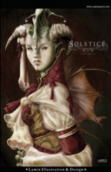
Here is the final with all of the fun flourishes highlights and shadows needed to give an a image that little extract push towards believable.
Thanks for checking out the first of many "process" blog entries that I'll be posting!
Check back soon!
Lamin


I love seeing the processes artists go through to create their work. I thought you said you weren't that good at colouring? All lies.
ReplyDeleteI'm still learning as much as I can. It's still kinda' new to me but I absolutely love it.
ReplyDelete